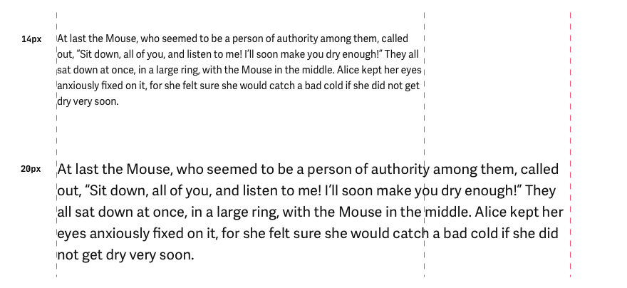
Line length
Line length matters in all interfaces where captions or text consists of several words. Typically 60 to 80 characters per line are the ideal line length for text in English for any UI.
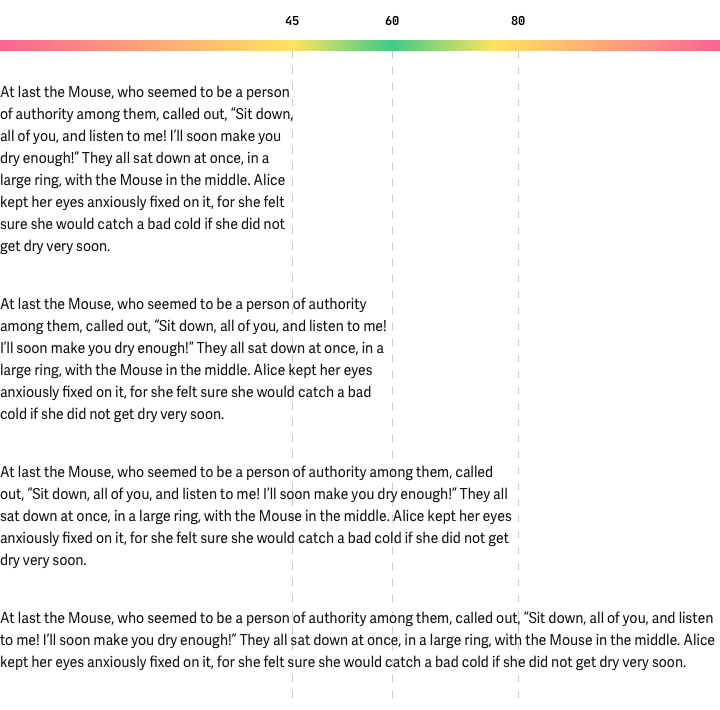
Texts on a long line are tiring to read; we find it hard to switch from one line to another because the column is too broad.
And more often than not, visitors do not understand why they have difficulty reading the text. Few people know about such a concept as the optimal length of the line, and hardly anyone will calculate the number of characters in a line to conclude. People just don't read that kind of text. A long line shows a bad attitude toward typography and reduces the quality of the information.
Keeping your attention while reading the text becomes problematic if the line length is more than 100 characters. It is more difficult to move your gaze to the following line. It makes it difficult to read and worsens interest in the content. This is especially true for large texts. For small paragraphs, it is not so critical.
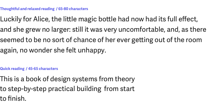
The choice of line length depends on the content and how and what kind of information you want to give. The shorter the line length, the faster the information will be read. Conversely, a longer line implies thoughtful and relaxed reading.
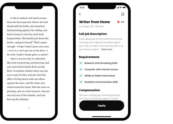
The line length depends on the context and the device your design uses. Mobile devices have an acceptable line length for any text between 30 and 40 characters.
As always: test and verify. If the text and other captions are comfortable to read, then you've done everything right. If not, increase or decrease the text size or change the column length.
Short and long
Always rely on the amount of text, and build a suitable line length. If there is a lot of text, it is better to make the column wider, reduce the text size, or shorten the text itself.
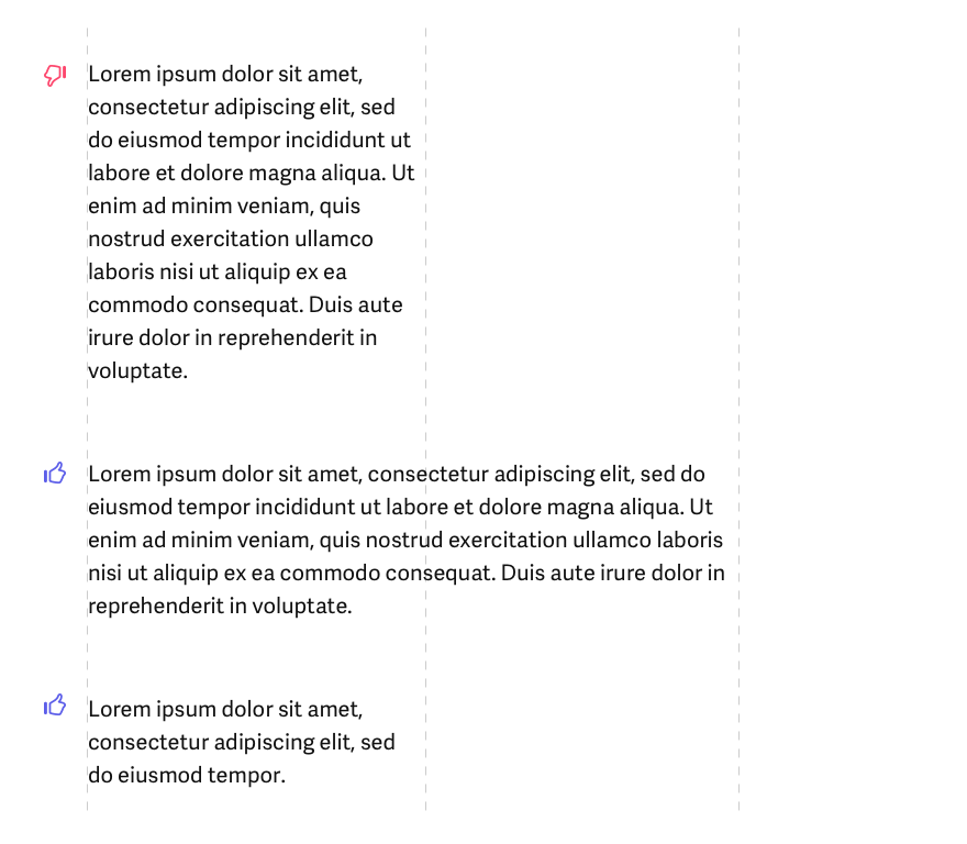
Short lines are easier and faster to scan, but only if the text itself is short or has a small size. If there is a lot of text, it is better to find a combination of size and line length that will be most convenient.
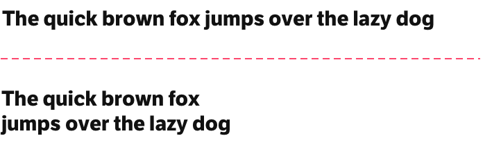
Line length is critical for headings as well. A long title is more difficult to read and understand. Therefore, it is better to divide it into several lines.
Choosing an acceptable line length is a task that occurs all the time in design, and for every text, you need to be careful about it. Otherwise, you might get a sloppy and messy design with texts the user doesn't want to read.


Always be careful with the line length of your texts, and you will see how easily and simply the quality of your work increases.