Body text
Body text determines how easy it will be to read the information on your interface. In fact, body text sets the design look because the text takes up the most space in many interfaces. And the quality of the design can directly depend on how well you choose the size of the body text.
Understanding the type and content of the project
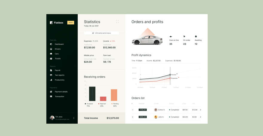
The choice depends on several things. The first is the type of project and its purpose. For dashboards and admin panels in the web, the text size can be smaller than for other UI because keeping the information dense in this design is often important. So a well-readable typeface of 14 to 16px is an acceptable solution.
Marketing and e-commerce sites may require a slightly larger body text size, as information density is less important here. Instead, accents and focus points are more critical, and font sizes 15 to 17px will work better.
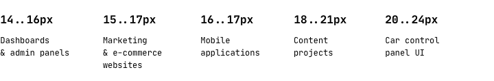
Content projects will need a font size of 18 to 21px. Larger text for content is easier to read and requires less effort from the user. It will build good readability for long reads.
Context of use
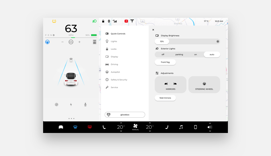
The choice of body text size can often depend on the type of device and the interface's context. For example, for control panels in cars, it is best to pick a body size of 20 to 24px. This way, captions will be readable at a sufficient distance, and the driver will not have to strain to read and reach for the screen to see the letters.
In mobile interfaces, Google and Apple guidelines recommend 16px and 17px for body text, respectively. These sizes always ensure good readability of texts on the small screen.
Two types of body text
Suppose the interface combines long reads, a marketing homepage, news cards, or other modules with various content. You may need to select two kinds of body text sizes. The text in a news card can differ significantly from the text inside the article, which you will get after clicking on the card.
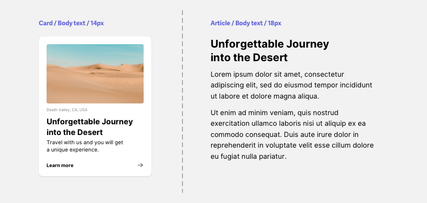
In some cases, it makes sense to choose two body text sizes and build typography for two different types of content. This will achieve balance and harmony on all screens of the project, regardless of the kind of content on them.
Font parameters
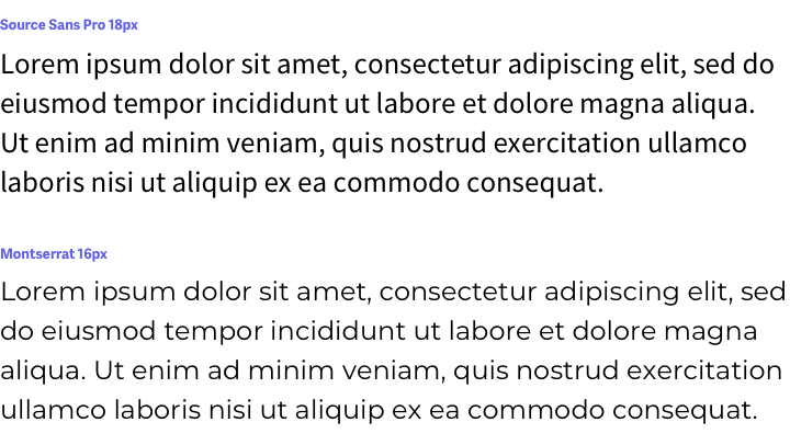
The choice of body text size can often vary depending on the typeface selected. The same text size may look different in different fonts. In some, it will appear smaller or larger than others.

This difference depends primarily on the height of the lowercase letters, called x-height in typography. Some fonts have a low x-height, so the text appears to be typed in a smaller size.
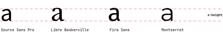
So it's worth taking a closer look at the font parameters and testing different sizes to get the best body text for your project.
A well-chosen body text size is one of the foundations of building quality and cohesive UI design. So try different variants and test them in practice to find the best fit.