Headings
Headings create the structure of the interface and text. They help guide and direct users' attention and make the content more user-friendly, improving understanding of the information.
Balance
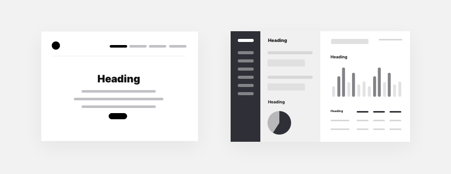
Balance and calm are essential in user interfaces. Large, contrasting headings don't always make sense or matter. They can be distracting and interfere with receiving information or taking action.
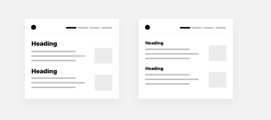
This is especially critical in those interfaces that require more information density and where data is most valuable, so the focus should be on the data itself, not the headings.
Of course, the main appeal can be significant and explicit if you're making a landing page. The headings can be quieter and more balanced in dashboards and other control panels.
Sometimes it seems that a strong contrast will be the best solution. But all the interface typography is tied together, and even a normal-sized body text with a giant heading will not look good.

It is better to reduce the heading size to make it more balanced with the text or, conversely, to increase the text's size by adding a lead paragraph.

Weight
Often you don't need to make the heading larger than the text because the weight of the title already has enough contrast with the text.

The heading may not have a bold style if it is large enough. Although this is a challenging technique and requires excellent work with the ratio of the heading size to the text. You must ensure that the text is weaker in contrast to the heading.

You can type the heading with Black, ExtraBold, or Heavy. This gives perfect contrast and makes it stand out from the other elements. However, it is essential not to overdo it and leave only one heading on the screen in this way. Otherwise, the entire design becomes overly saturated and even messy.

Size
The size of the headings depends on the size of the body text. The larger the body text, the bigger the heading. Usually, a good ratio is 1 to 3 to body text. The bold style gives good contrast and a balanced design. Making the ratio of the heading to text more than three is unlikely. It can upset harmony and balance.
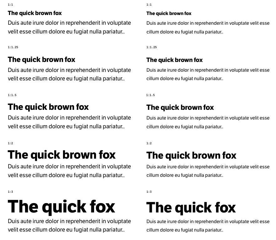
When creating a design, it's convenient to create tables like the one in the example above by first selecting the headings manually and checking how they work with the text. Then you can already pick the exact values of the heading sizes using the modular scale we discussed in the Principles chapter.
All caps
All caps headings are usually hard to read at large sizes. Even worse if the heading is long and divided into several lines.

A short and small heading typed with all caps reads well and can be a great decorative option to create contrast without increasing the size of the heading.

Letter spacing
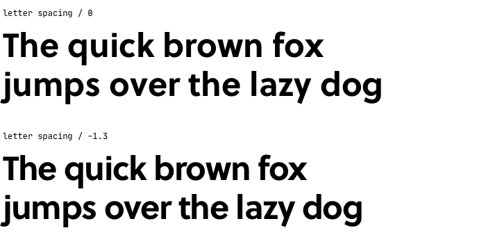
It is worth remembering that in all caps headings, it is necessary to increase the letter spacing slightly. Increased letter spacing creates space between the characters and helps them to be perceived better as separate ones. In this case, the heading does not turn into a single solid black line.

Headings not typed in all capital letters often require lower spacing between characters. It will give a nice balance and make the heading more coherent. There are no strict rules for letter-spacing; it depends on the size of the font and on the font itself. So it depends solely on practice and experimentation in your case.
Line spacing
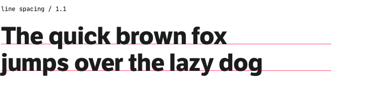
Headings have rules for line spacing, which differ from how we do with text. Whereas for the text of all sizes, you can choose a single line spacing value, such as 1.5, and it will work fine. But in headings, you need to select the value for each size separately.
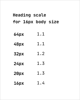
As a rule, line spacing for headings is between 1.1 and 1.4 of their font size. Larger values cause problems. If the heading is two lines, the second line may fall off.
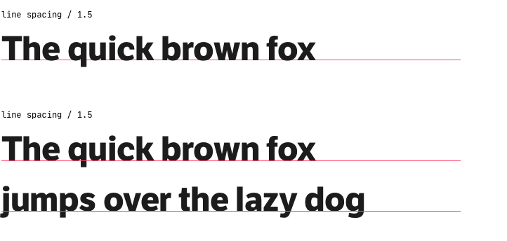
Always check headings by making them on two lines. It helps to find the proper line spacing and avoid mistakes. Many interfaces are adaptive, working on different screens, and at some point, a two-word one-line heading may well become a two-line heading.
Rhythm
Headings create the structure of the text. It makes sense to emphasize the rhythm of the text with balanced and adequately chosen spacing from the text to the headings. This makes the design and the text itself solid and reliable-looking. But more importantly, the correct distances between headings and text introduce the right pauses into the content and help separate one semantic section of text from another.
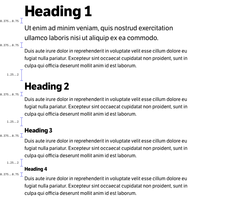
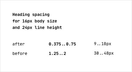
It is ideal if the spacing between the heading and paragraphs is based on the relationship to the line spacing of the body text. This gives incredible harmony and wholeness. But you can pick relative values if you are designing based on a 4px, 5px, or 8px spacing scale. Generally, after the heading, a reasonable distance would be 0.375...0.75 of the line spacing of the body text. And before the heading 1.25...2 of the line spacing.
These values are perfect and can serve as a guide. But of course, it depends on the body text size and the headings themselves, as well as on what tasks you have in mind. Therefore, each project may have different spacing values.
Divider
If you create dividers in the content, for example, for more expressiveness or additional emphasis on the text, it is worth paying attention to its location relative to the title.
It turns out that the heading and text become different modules. The divider between heading and text breaks the single meaning of the content. If you didn't want to do that on purpose, it's better to put the divider above the heading.
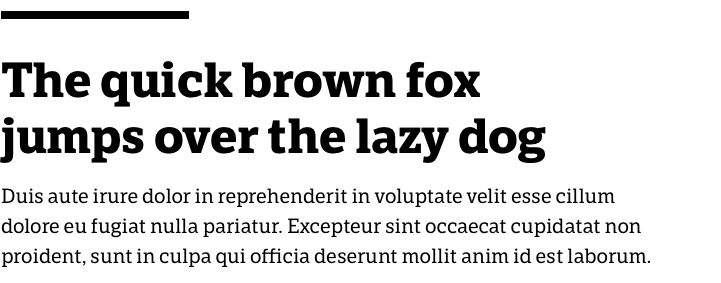
The divider above the heading does not break the single meaning of the content block and helps to increase the focus on it.
Color
It's good when the heading is black on a white background. It is the best combination for readability and proper contrast. Sometimes it makes sense to do the heading not pure black but to tone it down a bit or give it a warm or cool hue. This can help create a balance of the titles with the overall design. They will be less contrasting, but it's worth muting just a little bit.

A color heading is a good way to create contrast between text and draw extra attention from users. It often looks spectacular.

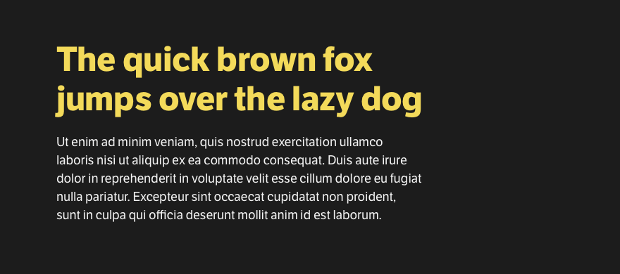
It sometimes makes sense to make the heading less bold on dark-colored backgrounds, especially on black. In some typefaces, the bold weight is too strong, and headings look too contrasty.

You can do the heading in regular font or semibold and then it will be more balanced on dark backgrounds.

Sometimes, a colored heading on a black background creates interest and provides a good impression. This is a great solution to give the design more appeal and break up the black and white look.
Color can add attention to headings and make them even more emphasized, but it requires a careful approach so as not to make the interface too garish and, because of this, less readable.
Familiar solutions and combinations, such as a black heading on a white background, always give more consistency and work predictably.