Quotes
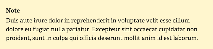
Quotes are a great way to make the text and its rhythm more varied. Notes, tips, and callouts can also be great tools that stand out from the text with their background, size, and other style.
Quotes can act as a standalone module, like testimonials or reviews. This is an excellent option to bring real people's lives and opinions into the content, which gives more credibility to the information in the interface.
Size and length
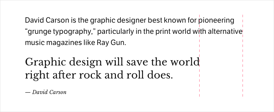
The size is the most obvious sign of a quote or testimonial. They can be much larger than the body text of the interface. But, if the quote or testimonial are used as separate blocks of content, then a large text size is a good thing. If the quote is in the text, it's better not to increase the font size too much. So that it doesn't ruin the rhythm of the text and interfere with the reading by its size.
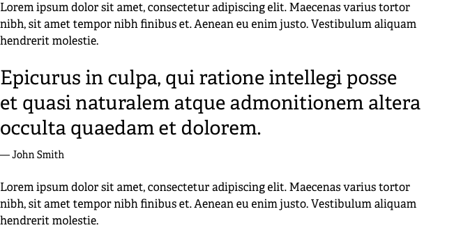
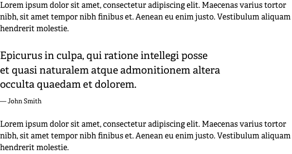
Most often, quotes are relatively short and consist of a couple of lines. So it is more convenient to read them from a shorter line, especially considering the text's increased size. It is better to shorten the quote's length than the paragraph's column.
It is quite acceptable to make the line spacing at the quote a little less than the main text if the font size is large and the quote is short.

Style
If the font size in the quote is large enough, as a rule, it is not necessary to make it a special style. Together with a typeface that contrasts with the body text it is always enough.

The text of the quote can be bold. This design helps create a strong contrast between the other text and the quote. Sometimes the high contrast can play a vital role.

It is beautiful if the quote has a decorative mark larger than the text size. This visual trick creates a good attention point and will keep the user's eye on the content.

But if you use a beautiful typeface for a quote with an excellent letter design, then the classic quotation marks can be a minimalistic, simple, and most effective solution.

Author
You shouldn't make the source or author's text in muted color at all. It looks frankly bad, and it makes too little sense.

It is better to achieve a difference by contrasting the quote's size and the caption's size. You can go for a ratio of 1.25 to 2. For example, the caption is 18px and the text of the quote is 32px, i.e. 1:1.75.

For testimonials, it is good to add more details. For example, position or profession, city, country, company, slogan. This is both beautiful and useful and causes more trust. Besides, it works well when there is no possibility to add a photo of the person who left the testimonial.
Quotes in design are more than just a callout in the text. It's a full-fledged tool for making content more visually appealing and easier to read.