Text
When working with text, the main task of the designer is not to do any harm. It is better to prefer familiar and time-tested solutions, like black letters on a white background, than to complicate the design and put too much color, variety, and decoration into the text, which will only distract and interfere.
Nevertheless, the text should be not only readable but also appealing, especially if it is an interface that sells services or products. Quality work on the text's color, alignment, and balance helps create a better impression on the user and generate more trust.
Color
In serif fonts, the letters are usually thinner than in sans-serif, so you can use pure black text on a white background. This does not make the letters too contrasty. For sans, it's fine to tone down the black a bit.

On dark backgrounds and especially on black, it is almost always worth reducing the contrast of white or making the dark background less dark. Especially if the font's letter design has a strong thickness.
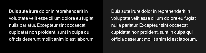
White text on a dark background looks exciting. Still, it is more suitable for short texts and individual interface blocks when you want to attract attention and diversify content presentation. Long texts can be challenging to read on a dark background, and finding a balance is crucial to make it work well.
Colored text raises questions and looks strange. Rather, colored text is more appropriate if you want to show feedback, such as messages about errors or the success of data completion. But you should be careful when choosing colors, some of them require careful work. Green, for example, will almost always need adding more black to make the text read well

Color text, in general, requires special attention and mandatory testing, including on different screens and devices. Otherwise, it may turn out to be poorly unreadable.
Alignment
Center-align text is only suitable for short lines and three or four lines at most. If you have a lot of text, it's hard to read when you center it.

In general, it is better to prefer left or right alignment for languages that read from right to left for readability. This makes the design more elegant and always easier to read.
Variety
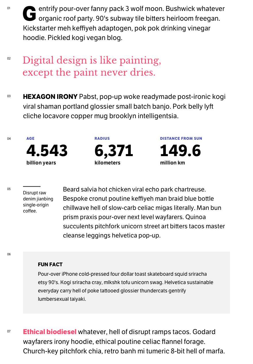
Images are the easiest way to add variety and appeal to text. But sometimes, you may not have an illustration for content, so many small solutions can give variety and attract users to read. These are primarily lists and quotes, but more subtle ways work well and help make the text stand out.
In fact, to read a long text in a single column is normal, and variety does not always make sense. It is bad when everything is flashing and flickering, and the text is constantly interrupted by irrelevant callouts and overly bright and colored blocks.
We read books and long articles if it is a good and interesting text and has no problems. So variety is a delicate job and requires careful thought and understanding of the task.
Features
If you make an interface for different languages, it is important not to forget the text written in hieroglyphics; it usually requires a slightly increased line spacing value.

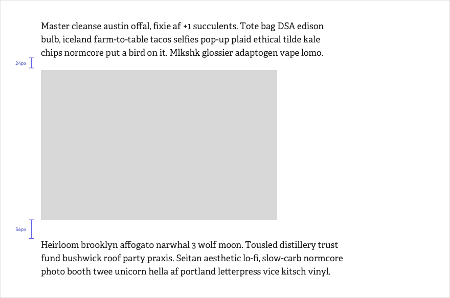
If text follows an image, video, or table, it's worth increasing the distance to the paragraph. This will give a nice pause between the different types of data and make it easier for users to switch back to text.
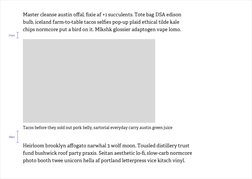
If an image, video, or table has a caption, the distance to the text can be increased even further. In this case the caption will not conflict with the paragraph that follows.
Text is one of the most important components of an interface. Text design can affect the usability of the UI. Therefore, it is worth paying attention to detail, testing decisions, especially in those interfaces that will work on different screens and devices.