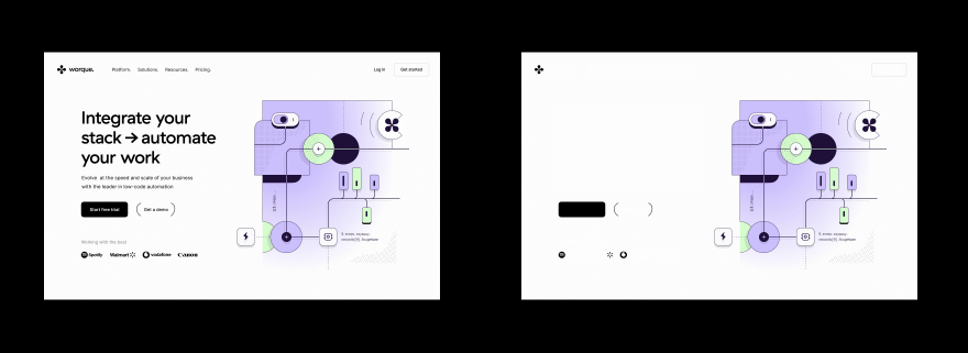
Why does typography matter
Typography is what readers will judge when choosing a particular site/application. It can be a subconscious decision. Just as people distinguish professional music from bad amateur music.

People see harmony, balance, and rhythm. People distinguish good composition from the bad composition. They do this throughout the day, conducting many comparisons, identification, and analysis processes.
It looks "reliable," it looks "beautiful," it seems to be "well-made," all the result of an analysis of harmony, balance, rhythm, and other basics of perception. People do this analysis in a fraction of a second and base their choices in favor of one or the other. Good typography helps to make a choice.

Typography is based on the same natural and mathematical principles as everything else in the world. People can see the harmony, the balance, the color ratios, and the size ratios in good typography and make their decision based on that. So all other things being equal, people will choose good typography over bad.
Typography also has a purely practical purpose. It's about setting accents and separating the primary from the secondary. This is also important in making choices for the reader, especially when there is no time to choose.
Readers prefer a document where accents and meanings are immediately visible, and they can catch the information they want with a glance. It would be an easy choice if the second document were a solid text in small print, without noticeable accents and separating the main and secondary.