Rhythm and variety
Rhythm and variety affect how engaging the content is for users. The more attractive the layout, the more likely users are to spend more time exploring the site or using the interface.

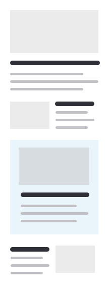
Variety in the presentation of the content applies to any interface. A long, monotonous list on a mobile screen is not interesting to read, and users just scroll through it. So it's always better to mix the uniformity with callouts, backgrounds, and unusual blocks that stand out from the others.
Sometimes the rhythm doesn't have to break the content itself. You can put callouts and images outside the layout to make the text more appealing, and the text itself can be read without interruption.
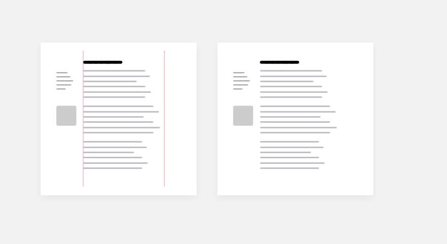
For long texts, it's good to use outset for images, media, quotes, and any other blocks that are different from the text. It also makes the text column more interesting, changes the rhythm, and doesn't break the reading.
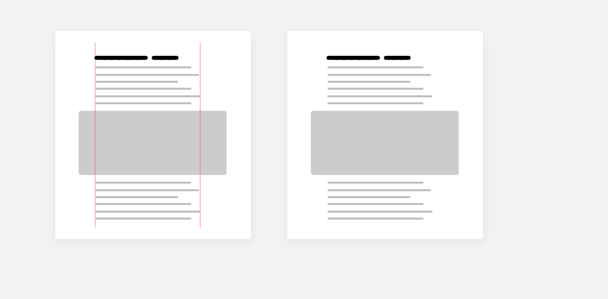
Generally speaking, any block that is different in its parameters is always a good technique and can be used in any interface. For example, a large quote or testimonial will clearly stand out among other content and will definitely add appeal to the monotonous rhythm.

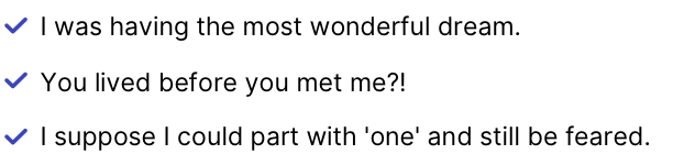
It's the same with lists. They can make a variety of long text or act as independent interface blocks.
Just don't go overboard. This is especially true for long reads. Users have come to read the text and don't like to be interrupted by animated callouts or quotes that take all the attention. It gets in the way of reading, and here variety and rhythm disruption play a destructive role. Everything has to be in balance and with adequate contrast.
Adding variety to the design is not only about the whole layout but also about the details in the content. Small text columns with features are always more interesting than a brick of text.
You can make any text attractive in different ways and in small details, including those in cards, in snippets of news articles, or in description texts on dashboards. Such little things draw attention to a piece of text and make users want to read it with more desire.