Responsive typography
When you design an interface that will work on different screens, you should consider whether the typography will change depending on the size of the screen.
On the whole, all typography guidelines remain the same on small or large screens. Only a few changes may be necessary depending on the context and how we interact with a specific screen.
It's always a good idea to reduce the size of titles on small screens. The heading sizes on mobile don't have the same importance and effect as on larger screens. In addition, they take up too much space sometimes, which is not helpful for good content reading speed.

Small screens do not require a strong hierarchy of headings because usually only part of the text and the heading itself is visible, and everything else is hidden by scrolling. So there's no point in expressing text structure with headings.

For big screens, it's not very important to make headings larger than for normal screen sizes. Users interact with these screens close enough that if the title is too big, they must lean back to read it.
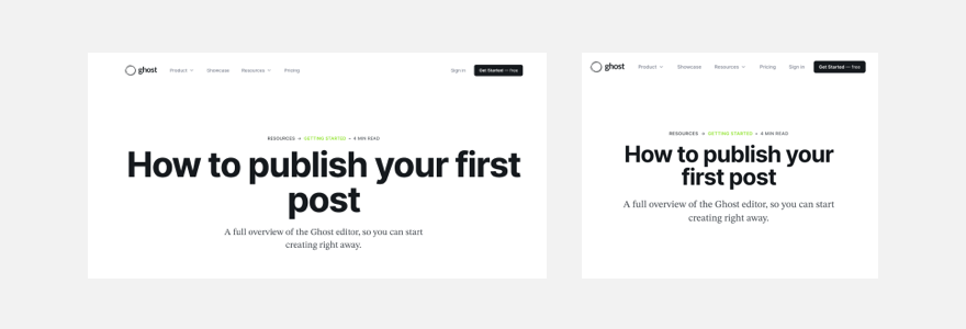
As a result, large headings and text on big screens make readability worse. And this applies to almost all situations where the screen is huge. For example, users interact with a giant touch panel at arm's length, which is close enough and doesn't require any special effort to enlarge headings.
That said, of course, you need to test and verify your choices because too much depends on the interface's context and the information in it. Generally, it's better to rely on testing in practice than automatically increasing all text and heading sizes by a specific ratio on large screens. It's better to look at each heading individually and how comfortable it is to read on the big screen and draw conclusions.
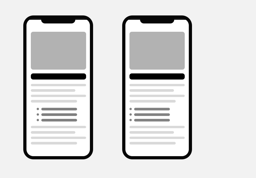
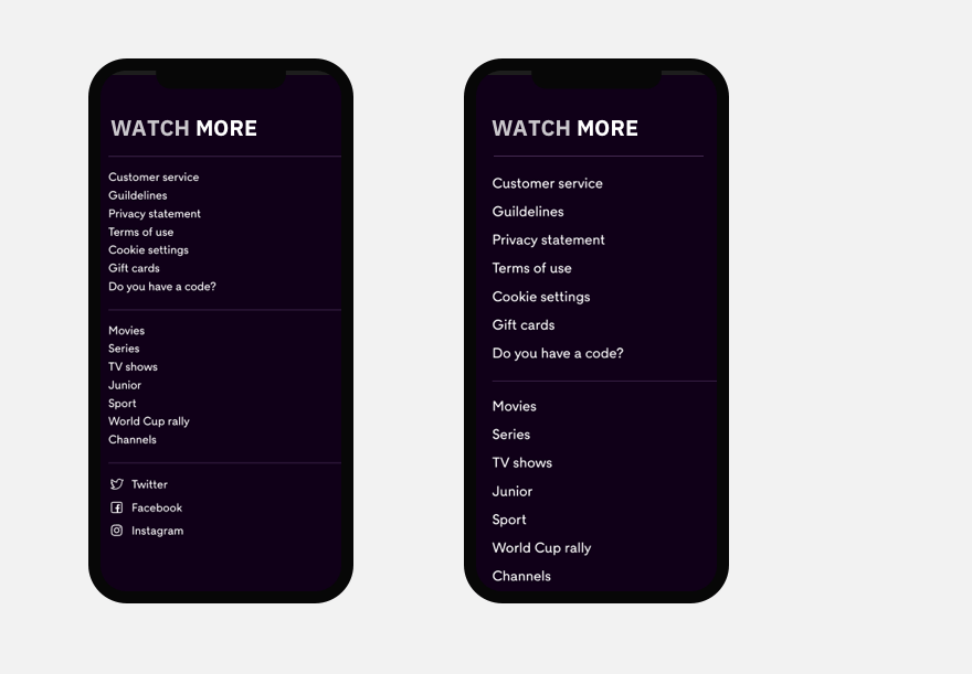
Usually quotes and lists are left indented. On mobile it is better to make it zero for them. On a small screen, horizontal space is significant and it is better to use it sparingly.
On small screens, it is preferable to use the guidelines of Google and Apple for Android and iOS, which recommend using body text size 16-17px. These are comfortable values for good readability on mobile screens, and you should not make the main text smaller than these values, except for additional hints and small captions in labels and tags.
Navigation on small screens is essential. It's worth remembering that the clickable area on mobile should be larger than on desktop. So it's a good idea to increase menu links and distances between items.
There are no exact rules or magic ratios for all possible screens in responsive typography. Only practical testing can provide answers and insight into how to do things better.