This is a book that is always good to have at hand, open it
at any page and it will help as a design reference.
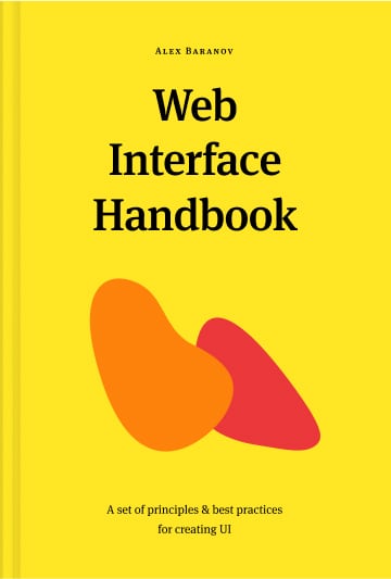
Web
Interface
Handbook
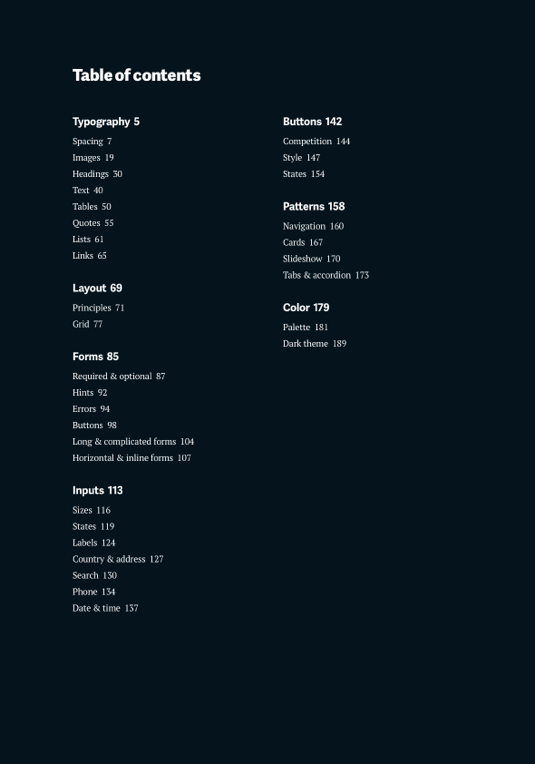
This is a book about the fundamentals of creating a good web interface. You will find out how to make effective forms, typography, grids, and many other components of web design.