
How to create a color palette for design systems
What is a color palette?
Color palettes, also known as color scales, are essential for any design project as they consist of a set of tints and shades that define a project's semantic colors. These values are then used to shape the look of UI components, states, illustrations, and overall design style. A well-crafted color palette is a balanced tool that speeds up all design processes and takes care of routine tasks.
Creating the perfect color palette is crucial, and sometimes, a wrongly created palette can get in the way of the work and not allow you to realize all the necessary needs of a project. To avoid such typical mistakes when creating a scale and save time picking tints and shades, we will look at a method that always works for any design and color. This method will serve as a reliable assistant throughout the project, from start to finish.
Find your base colors
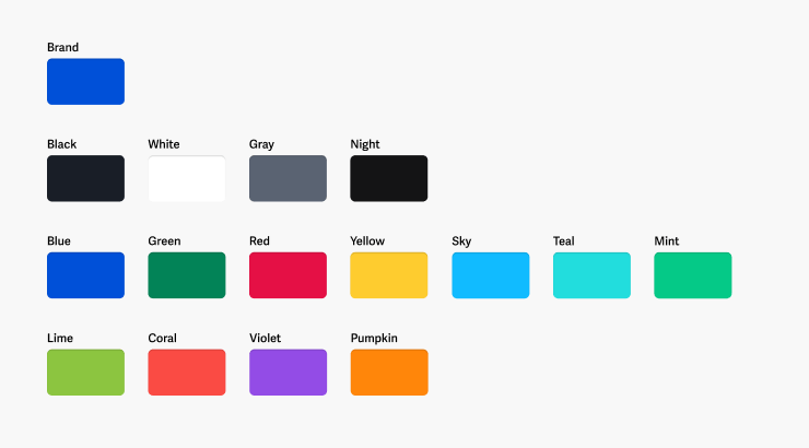
Base colors are essential colors that establish the foundation of a design. They dictate the overall appearance of the project, and serve as the basis for creating tints and shades of palettes. These colors are typically referred to as corporate colors, component states, black and white, specific product colors, accents, and various other purposes.
Brand or primary color
Choosing a brand or primary color is important for accentuating the main elements of a design. For websites and apps, the main accents are usually the action components such as buttons, links, and captions.

It's best to select an accent color from your corporate palette for consistency. However, if a suitable color is not available, you can choose any primary color that seems fitting. Don't worry too much about it, you can always change it later if needed.
After selecting a color, test it on actual components to make sure it works well. Pay special attention to the contrast and brightness of the color. If the color is too bright or dark, adjust the saturation and lightness accordingly.
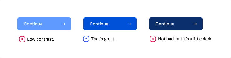
Occasionally, a primary color can be too bright, like yellow. In this case, it's better not to use this color for links or accent text.

However, a set of shades can be created with the right values suitable for any situation. The most important thing is to have a base color that can be used as a foundation for the rest of the design.
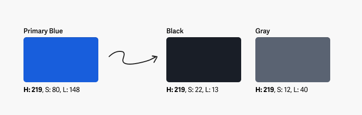
Black, white and gray
When designing a website or app, it's crucial to incorporate black, white, and gray as the foundation colors. These hues play a significant role in every project, serving as the dominant colors for backgrounds, text, and form controls.
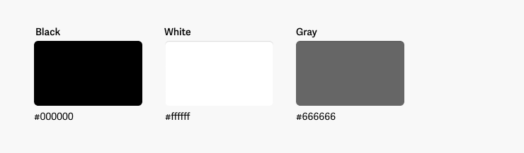
With white it's simple, it's always #ffffffff. Black can also be used in its purest form as #000000. Gray is the in-between color of white and black, with a lightness of around 40-50% on the HSL scale.
To add more uniqueness and expressiveness to the design, try mixing primary colors into black and gray. Doing so will create a softer and more harmonious feel for any design elements that use these colors.
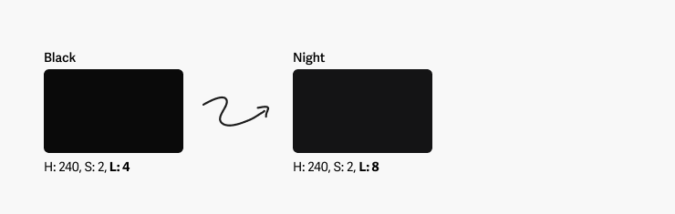
Night color
It's difficult to create a high-quality user interface these days without including a dark theme. So, it's important to choose the right color for the dark background of your website or application. Black is often too harsh and makes light text difficult to read.
Instead, you should opt for a night color that is slightly lighter than black for the background of your UI in dark mode. By increasing the lightness by a few values, you can create a soft background that will help you find more balanced shades for your dark theme in the future.
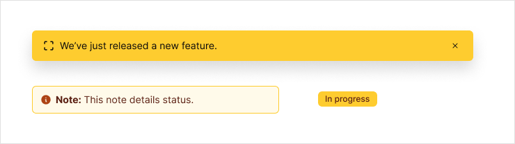
States
State colors are used to display the interactive values of components and text. These colors represent various states such as errors, success, focus states, and so on. You typically have five states available to you.
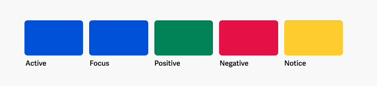
The active (or selected or current) state is used to highlight the current or selected states of components. It is usually the same color as the brand or primary color, but it can be different if the primary color is not suitable.

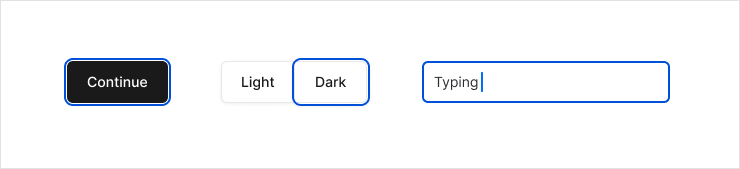
The focus state is used to indicate the state of focus in components like a focus ring around a button or input element. The color for this state is usually blue, which is commonly used in UI.
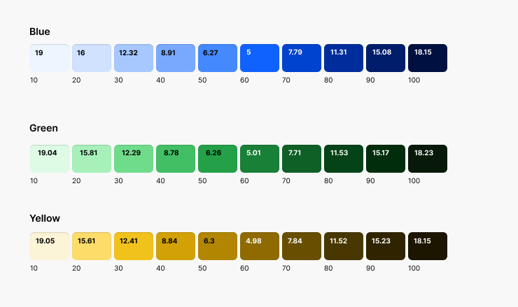
The negative state is represented by a color that is used for errors, destructive actions, negative trends, and accents. Usually, this state is represented by the color red, which can be used in various scopes. That's why calling it 'error' would be too narrow. Negative state is a broader concept.
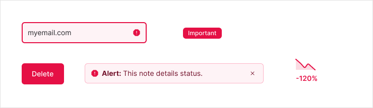
The positive state is represented by a color that is used for successful messages, positive trends, and accents. Typically, this state is represented by the color green. Like negative state, this color has a wide range of scopes, and thus the name 'success' does not reflect its meaning very well.

The notice state is represented by a color that indicates information or component states that require attention or should be highlighted in the interface. Typically, this state is represented by the color yellow or orange. Often, this state is called 'warning,' which is too narrow in meaning and scope. Therefore, I prefer the term 'notice' as it is more semantically correct and has a broader meaning.
Additionally, there are hover and pressed states that primarily vary in shade, rather than color. For this reason, there is no need to create a distinct color for these states.
Secondary, tertiary, etc.
The primary or brand color serves as the main accent color, but additional accent colors may be necessary for captions, backgrounds, and as secondary and tertiary colors to support the overall look of the design.
These colors can either be harmonious or contrasting, depending on their role in the interface and the context in which they are utilized.
Product specific
When it comes to designing, colors can play a crucial role in expressing and displaying products or services effectively. Often, different sections within a design will have their own branding and color schemes.
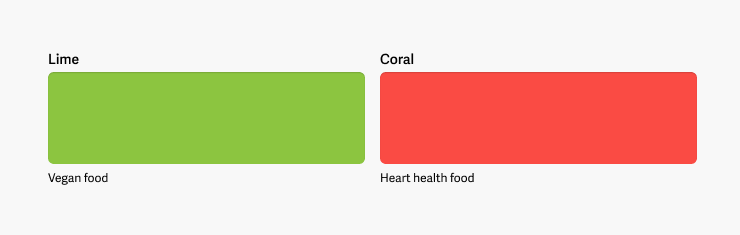
For instance, in online stores, products belonging to a particular category may have their own brand colors. Like, the vegan food section may use green as an accent color, while the heart health food section may use soft coral colors. This not only enhances the visual appeal of the designs but also makes it easier for customers to identify and distinguish between different products.
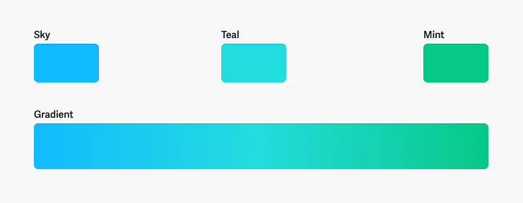
Gradients
Typically, gradients share the same colors as your primary or accent colors. However, there are instances where you might need specific colors just for gradients. Gradients can often be brighter than other design elements, or they can be soft and pastel, while the rest of the UI colors are more expressive and rich.
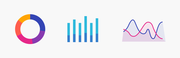
Charts
Choosing the right colors for charts is an essential aspect of presenting data in a clear and readable way. Chart colors are unique and should be selected with special care, considering their individual characteristics and rules of construction. In fact, the topic of color selection for charts is extensive and could fill an entire book.

Typically, I rely on two color scales for my charts: warm and cool. To select the colors, I begin by picking the two farthest colors with same temperture on the color wheel. Then, I determine how many values I need and use the HSB scale to adjust the hue gradually, creating distinct, harmonious colors that are easy to differentiate.
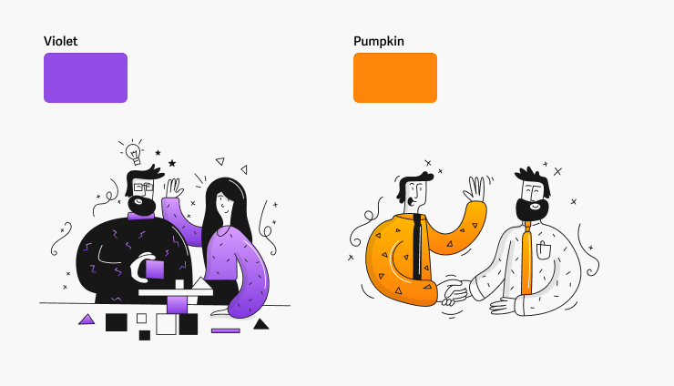
Illustrations
When incorporating illustrations into your design, it's essential to consider the color harmony of the overall scheme. While using existing primary and accent colors is perfectly fine, certain illustrations demand a unique color approach to convey meaning or enhance expressiveness
What is the outcome?
You will be equipped with a set of base colors to cater to your designing needs and objectives. For smaller projects, you might only require four to five colors, including primary, white, black, gray, and some secondary colors. However, for larger projects, sets of dozens of colors may be necessary, and that is perfectly acceptable. These colors serve as the foundation for creating all the palettes you need with tints and shades.
Make it transparent
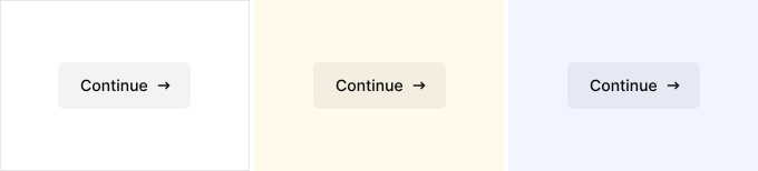
Even simple interfaces are complex and diverse in color schemes. Moreover, projects are often subject to change and expansion. For example, you can never be certain that interface elements will always sit on a white background. There may be instances where your form needs to appear on a yellow or light blue background.
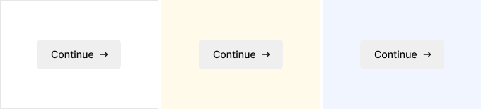
Unfortunately, gray elements and text on a colored background can look unattractive, detracting from the overall design. To ensure your design looks clean and polished, consider creating color sets with transparency in your palette.
At the very least, you should have scales of transparent colors for white and black. The number of colors in the scale will vary depending on your project. It's best to use a certain step, such as 10%, and include a few values for very low transparency (3%, 5%, 7%). This will help you cover a wide range of tasks.
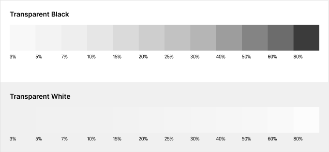
To name the values in the scale, I find it helpful to use this naming convention: black-a60. The transparency index follows the color name and is preceded by the letter 'a'. This makes it easy to find the value in design tools like Figma. By typing 'a + digit', you can access the color options in your list quickly and easily. This approach saves time and reduces the likelihood of confusion with other colors in your palette that don't have transparency.
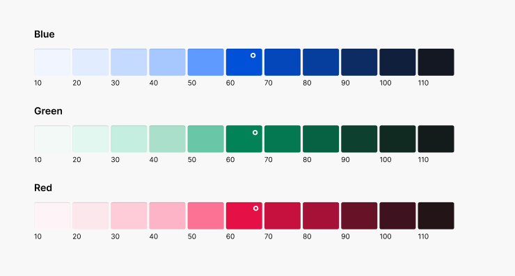
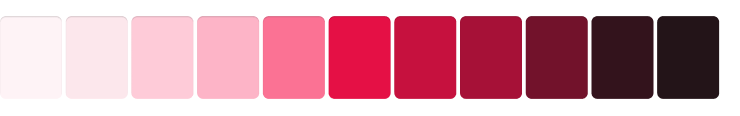
Create tints and shades
Color tints (light) and shades (dark) offer a wide range of design possibilities by introducing variations in elements and their states. This feature enables the creation of interactive interfaces, highlighting important components and distinguishing secondary ones using color. Therefore, it's important to have a set of tints and shades derived from the base color to achieve the desired results.
When it comes to creating tints and shades, there's an element of magic involved that makes it difficult to find a comprehensive explanation of how to create an entire set of colors based on a main color. It's not as simple as just taking the darkest and lightest colors and using them to create all the others. What are the rules and algorithms involved in this process? It's a mystery that many have yet to unravel?
There are plenty of plugins and tools available for generating color palettes, but the problem is, each of them has its own hidden algorithms that you have little or no control over. As a result, creating the perfect set of tints and shades can be quite challenging. For instance, if a plugin generates only eight values, but you need twelve, you've hit a dead end.
However, some design systems suggest creating tints and shades based on the color contrast against black for tints and against white for shades. This approach involves using an algorithm that takes into account the contrast between the color and the background.
In this case, creating your own color and palette based on contrast values may seem like a simple task, but it's actually quite challenging again. Achieving the desired contrast values requires manually adjusting the lightness and saturation of the color, which can take a significant amount of time.
While it's possible to program your own algorithm to automatically create palettes, it can become a bottleneck for the project and limit its versatility and flexibility.
Make a color builder
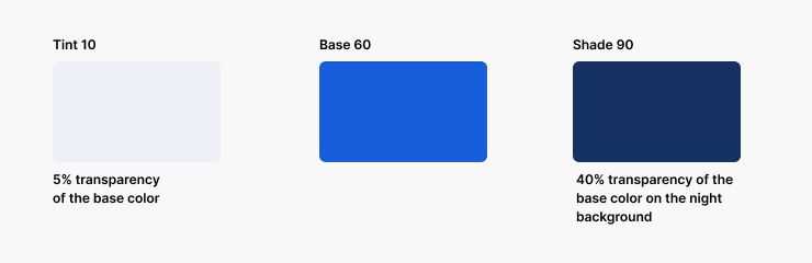
Fortunately, there is a solution. Construct a color builder. To create a palette, you can make the base color transparent for tints and add transparent on a darker color to get shades. I always use this method when designing palettes.
Here is a link to my color builder for Figma. You can see how it is set up and modify it to suit your needs.
The best part is that you don't have to manually select tints and shades. With true automation, you can change the base color and get all the values you need. This makes the method versatile and allows you to create as many tints and shades as you require, making it perfect for light and dark themes.
You also get independence with this method. The tint and shade creation will follow your rules without any magic, and you won't be bound to using a plugin or other tool with its own algorithms. This means that anyone who works on your design can understand how to build a palette and can add their own colors to solve problems.
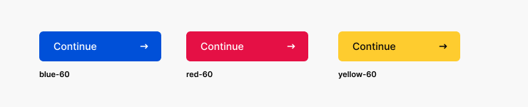
Finally, with this method, the base color will always have the same index in any palette. This means that a surface accent color of 60 will always be 60, whether it's a blue, red, or yellow button.
Color groups
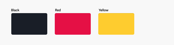
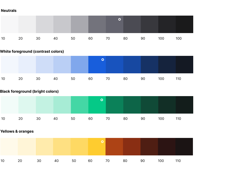
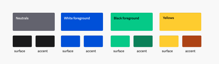
There are four color groups that vary in their characteristics: neutral (gray), contrasting colors with white text, bright colors with black text, and yellow/orange colors. Each color group requires a different approach, taking into account their unique nuances. For bright colors, darker shades are needed to ensure good accessibility for text and elements. The same applies to yellow colors, where an overlay of red can be used to prevent the shades from appearing dirty.
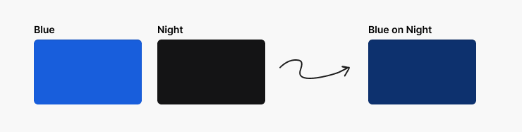
Harmony on a dark backgrounds
Overlaying a dark color on shades make it the color you will use as a background in a dark theme. This will automatically make all shades harmonize in the dark theme and they will always have more contrast than the background.
Fine-tuning
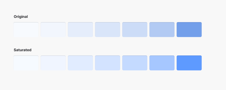
To fine-tune the selected colors from the scale, saturation should be added for the final tints. Blue and green colors may lose their brightness due to transparency, so it's important to adjust their saturation accordingly. For shades, saturation can sometimes be lowered a bit more. Additionally, for yellow shades, tweaking the hue towards red will make them more rich.
Symmetry for a dark theme
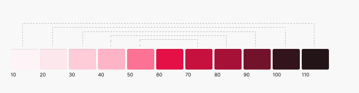
The builder's scale is designed in such a way that color 10 in the light theme is equivalent to color 110 in the dark theme. This is a helpful feature when building logic, but it isn't an absolute rule. If you use 10 in the light theme, you can use it in the 90 dark theme if the design requires it.
Naming
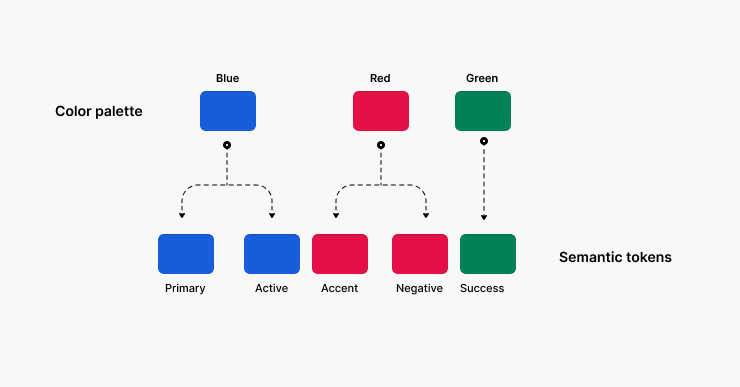
Refer to colors by their names like blue, red, and green, instead of semantically like primary or positive. The colors from the palette serve as a base for constructing semantic colors and design tokens, so the color blue from the palette may have a different meaning in the process of constructing semantic colors, such as being primary, active, and even the accent.
How many values are enough?
Create numerous tints and shades, but not too many. Based on my experience, 15 colors are the perfect minimum for any design. This set of colors is adequate to execute any kind of components for both light and dark themes.
Using fewer than 10 colors is not enough. Especially if you plan on doing a dark UI theme. Also, scales like this can be limiting and less universal in general.
More than 15 colors is too many. Including too many values can reduce contrast, increase complexity, and create confusion, which goes against system.
Test it
Test all tints and shades on actual design components. Modify the transparency values in the builder for the tints and shades if necessary to ensure that all values are appropriate for your task.
Making sure to check the contrast of the various backgrounds and texts that utilize the selected color is an important consideration.
Scalability
When you name tints and shades with numeric indexes, it's much easier to rename them all at once, especially in Figma. Additionally, it makes it simpler to expand the range of colors. You can always add an intermediate value like 15 or 25 without having to rename all the scale values.
It's best to use tens in numerical indexes, as using 1, 2, or 3 will not allow for expanding colors. On the other hand, indexes like 100, 200, or 300 can be tempting to expand too much, leading to confusion and chaos, such as 125, 150, or 175.
In conclusion
Here is a link to my color builder for Figma. You can see how it is set up and modify it to suit your needs.
In this article, I have attempted to cover all the aspects of building palettes for UI design. However, there are still many subtle nuances and tricks that I have not included, as it would have made the article endless.
Once you have created the palette, the big question remains of how to make the semantic colors of the design. This is a major topic that I will cover in the future, as there are many approaches and techniques to it. I have my own way, which I believe is the right way. It works so efficiently that it's hard to imagine anything better. Stay tuned for more updates.
Email me at ab@imperavi.com if you have any questions.
What’s next?
- See my books about design and UI.
- Check out Superkube Design System.
Subscribe to find out about
new articles and my books
Stay tuned and be the first to know about the release of my new
books and future projects.