Choosing typeface
Typeface helps to create the style and look of your design. It creates an impression and emotion, revealing the purpose of your project. The proper choice of typeface determines readability and the user's perception of the interface in the first few seconds when they open your website or application.
Readability
The choice of typeface can affect readability in the first place. Poor and inappropriate typeface selection can be crucial at the beginning of a design, and no other adjustments or methods will improve your work's result.


Sometimes a font can be legible, like monospace, but the text will remain challenging to read in different cases. Monospaced typefaces are better for short text and captions than for long text.
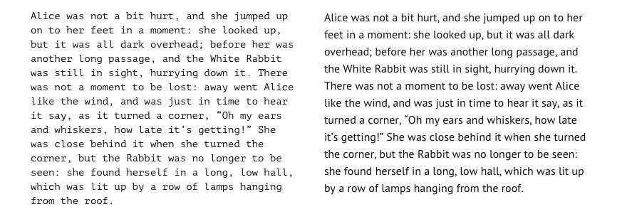
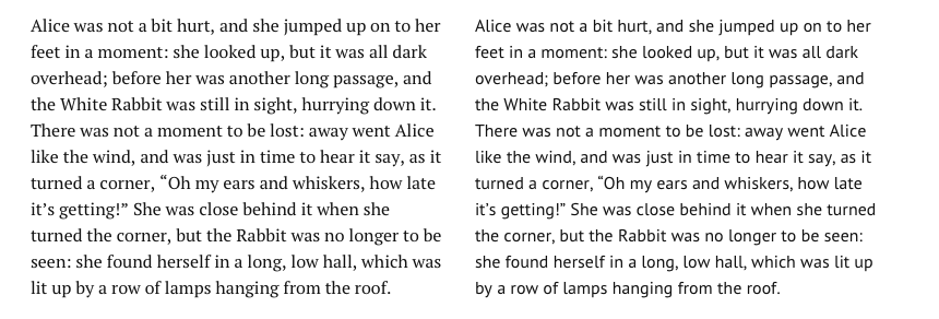
The serif typeface has higher legibility; as a rule, texts typed with it are easier to recognize and perceive, especially if they are long articles and books. But often, in direct comparison, it is not easy to see the difference in readability between serif and sans fonts.
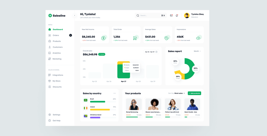
In marketing websites, dashboards, and other control interfaces, a sans font is more appropriate because it scans better and faster by the eye.


Readability is the most important thing in design. If your visitors and users can't comfortably read the text the whole design doesn't make sense.
Purpose
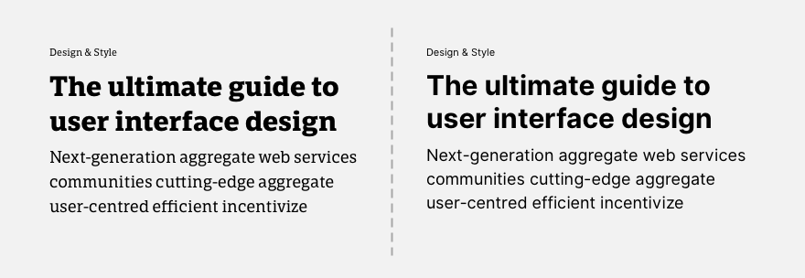
The choice of typeface may depend on what kind of project you are doing and what impression you want to create. For example, a serif font would be preferable for a serious news magazine, while sans, on the contrary, can make a friendly and simple presentation of the content.
The choice of font is emphasized not only by design style but also by content strategy, content writing style, and editorial policy.
For a website about technology and modern devices would be strange to choose a serif. Instead, sans or combinations of sans/monospace would be more appropriate.
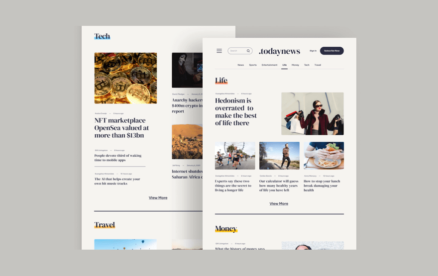
And definitely, if you make a dashboard or any other control panel design, it is better to choose those fonts that are well scanned by the eye and readable in small sizes. It's almost always sans font as the only choice.
So choosing a font can start with understanding what kind of project you're doing, what purposes it will be used for, and what results you need to get.
And, of course, not forgetting that readability beats even the purpose of the project. If some font would be easier to read than the one more appropriate to the essence of the project, it is better to choose the most readable.
Requirements
The font choice may depend on the technical requirements and context of the project. Some devices may have a strictly limited set of typefaces, and your selection will not be determined by emotion or sense of style.
Versatility
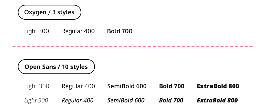
Some fonts have little weights and styles. Sometimes they are not even italic style. This can impose limitations on your project, making it impossible to do what you want. It is especially true for complex interfaces, which often require a large variety of weights and can't do without Semibold.
Try to choose a typeface that allows you to implement all the design needs and will not be a stopping factor in the future when expanding the project.
Performance
Often the choice of typeface is based on the requirement for high reliability and speed of the project. In this case, it is better to choose system fonts that do not require preloading and external import.

System fonts are a great challenge and a way to create solid and readable typography in the face of limits. You may need subtle and unusual solutions to make an attractive design. Although, neatness, hierarchy, and alignment will play a more significant role than a simple trick with a title made by some fancy font.
Budget
Fonts have different costs. And this can greatly influence the choice of typeface for a project.
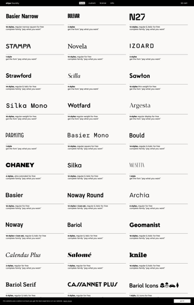
There are many free fonts at Google Fonts. Some are high quality, such as Inter, JetBrainsMono, Noto Sans, PT Serif, etc. In general, on Google Fonts you can sometimes find a good solution and combination.
But paid typefaces are almost always better. And it's a great investment in a project that will pay off by improving the quality of typography and design in general.
It is all about the detail and balance of paid fonts. Sometimes you can find paid typefaces that are perfect, have a bright personality, and make your work stand out.
Some studios or designers offer their models of paid fonts, so you can buy a good one at a reasonable price if your budget is not high.
The choice of typeface often depends on the technical and economic requirements of the project. It helps to challenge and, within constraints, achieve better results.