Readability
Usually, if the text and the overall interface have a good design, users don't pay much attention to it. They just scan or read the information and get what they need. The website visitors do not notice what font is used in the design; they perceive the words and read the text rather than enjoy the interface's composition and beauty.
Often, users will not be able to say exactly why this interface, where they quickly and easily find information or perform an action, is so good. They just are using it.
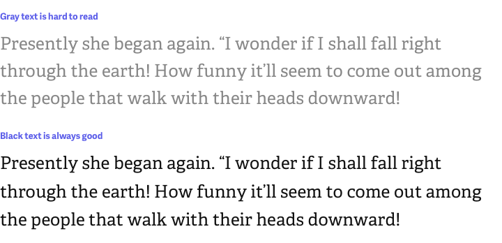
But everything changes if the design makes it difficult to read texts. Here all the reasons are on the surface, and any user will tell you what's wrong: too small font, too bright color, too faded colors, etc.
Poorly designed texts give users an impression of your interface in a fraction of a second, and they understand that it is made sloppy, not attractive. Such an interface will not deserve attention, does not give the impression of reliability, and will be uncomfortable to use.

There is one most essential principle of typography that is of utmost importance: readability. If the text is difficult to read in practice, then all other design is irrelevant. And this applies not only to long texts in articles but also to short captions, legends in charts, and all text in the interface in general.

Readability determines the ease and comfort with which text is perceived and understood. Whether making a dashboard with charts and forms or creating documentation with long articles, the texts in them must be readable and scannable to the eye.
Parameters of the text that make it readable depend on the audience you design for, the context, the type of device, and where and how your design will be used. Readability is measured by practice and testing. Until you and your audience have read the text, it's not clear if the design is good.
Readability of the text is a wide concept, which consists of many nuances and approaches. More often than not, readability is not affected by a single value but by the overall design, color choice, and small details, such as the parameters of button labels.

Unfortunately, no single set of rules works for any design and automatically creates good style and typography. For each project, there are different parameters and values, different principles, and different methods.
Fortunately, this book describes all possible methods for making any UI text with good readability.