Images wrap, float, outset
Redactor comes with features that let you easily position images, making your content layout more varied and engaging.
Wrap and float #
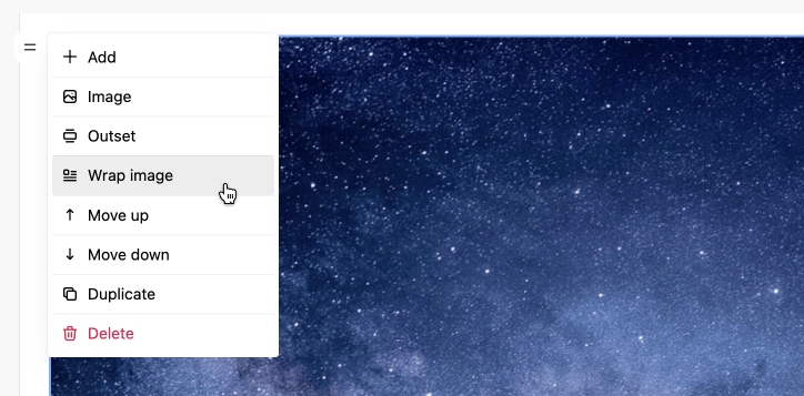
The 'Wrap image' command is in the dropdown list if you click on the image and then on the control to the left of it.
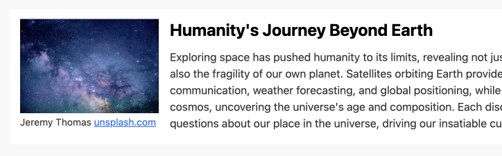
In the editor, you can position the image to the left or right of the text, this is done using the css float property. There is also centering of the image, for example, if it has a width less than the layout width. Below is an example where 'Wrap left' is done for an image.
To make wrap and float work, the editor has the appropriate css styles by default, which look like this:
.rx-content .wrap-center {
  text-align: center;
}
.rx-content .wrap-center img {
  margin-left: auto;
  margin-right: auto;
}
.rx-content .wrap-center figcaption {
  text-align: center;
  margin-left: auto;
  margin-right: auto;
}
.rx-content .float-left {
  float: left;
  margin-right: 1em;
  margin-bottom: 1em;
  max-width: 200px;
}
.rx-content .float-right {
  float: right;
  margin-left: 1em;
  margin-bottom: 1em;
  max-width: 200px;
}
You can use these styles on the page where the content will be rendered.
Outset #
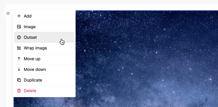
The 'Outset' command is in the dropdown list if you click on the image and then on the control to the left of it.
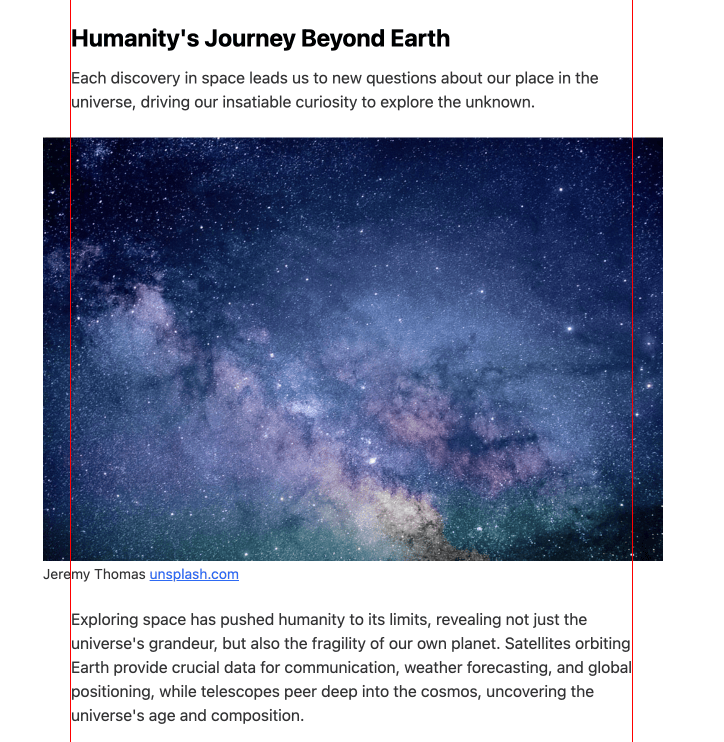
Outset allows you to display images beyond the left, right, or both edges of the layout. This makes the layout expressive, balanced and more solid. The example below shows the result of 'Outset both'. As you can see the image extends beyond both edges of the layout.
To make outset work, the editor has the appropriate css styles by default, which look like this:
.rx-content {
    --rx-outset-md: 28px;
}
.rx-content .outset-right {
  position: relative;
  width: calc(100% + var(--rx-outset-md));
  max-width: calc(100% + var(--rx-outset-md));
  transform: translateX(var(--rx-outset-md)) translate3d(0, 0, 0);
  left: calc(var(--rx-outset-md) * -1);
}
.rx-content .outset-left {
  width: calc(100% + var(--rx-outset-md));
  max-width: calc(100% + var(--rx-outset-md));
  transform: translateX(calc(var(--rx-outset-md) * -1)) translate3d(0, 0, 0);
}
.rx-content .outset-both {
  position: relative;
  width: calc(100% + var(--rx-outset-md) + var(--rx-outset-md));
  max-width: calc(100% + var(--rx-outset-md) + var(--rx-outset-md));
  transform: translateX(-50%) translate3d(0, 0, 0);
  left: 50%;
}
You can use these styles on the page where the content will be rendered.