Layouts and grids
Layout and columns #
Layout is a way in Reactor to make text or any other content into columns.
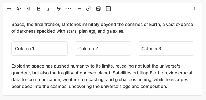
You can add layout using the Addbar menu by clicking the Add (+) button and selecting 'Layout' from the list.
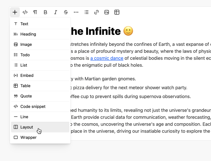
By default, Redactor offers several options of pre-prepared layout patterns with different column parameters.
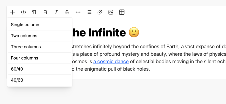
This is set in the layout setting and looks like an object like this:
{
    'single': {
        title: '## layout.single-column ##',
        pattern: '100%'
    },
    'two-columns': {
        title: '## layout.two-columns ##',
        pattern: '50%|50%'
    },
    'three-columns': {
        title: '## layout.three-columns ##',
        pattern: '33%|33%|33%'
    },
    'four-columns': {
        title: '## layout.four-columns ##',
        pattern: '25%|25%|25%|25%'
    },
    '60-40': {
        title: '60/40',
        pattern: '60%|40%'
    },
    '40-60': {
        title: '40/60',
        pattern: '40%|60%'
    }
}
Layout HTML #
Layout needs special markup for Redactor to recognize this. Just like specifying the width of a column using the flex-basis property.
<div data-block="layout">
    <div data-block="column" style="flex-basis: 50%">
        <p>Column 1</p>
    </div>
    <div data-block="column" style="flex-basis: 50%">
        <p>Column 2</p>
    </div>
</div>
If you set the code above in the content editor, you will get a layout with two equal width columns.
CSS for layout and columns #
Redactor's styles set a simple CSS for layout:
[data-block=layout] {
    display: flex;
    flex-direction: row;
    gap: 24px;
}
If you want the Layout to look exactly the same as in Redactor on your page or in your application, then add these properties to your CSS.
Override CSS #
If you want to change layout or column styles, you can add such CSS to the page where the editor is running:
.rx-content [data-block=layout] {
    gap: 12px;
}
.rx-content [data-block=column] {
    background: #eee;
    padding: 32px;
}
Note: On the page where you will display your content made in Redactor, you don't need to specify styles using the rx-content override. It's enough to just specify as is:
[data-block=layout] {
    gap: 12px;
}
[data-block=column] {
    background: #eee;
    padding: 32px;
}
Use classes setting #
You can use the classes setting to give layout and columns classes that define the view and other grid parameters.
Redactor('#entry', {
    classes: {
        blocks: {
            'layout': 'grid',
            'column': 'col'
        }
    }
});
In this case, Redactor will set the specified classes for all layouts and columns that were added to the initial code and that will be created through the editor interface.
<div data-block="layout" class="grid">
    <div data-block="column" class="col" style="flex-basis: 50%">
        <p>Column 1</p>
    </div>
    <div data-block="column" class="col" style="flex-basis: 50%">
        <p>Column 2</p>
    </div>
</div>
And of course in this case you can set your own styles for layout and columns:
.rx-content .grid {
    display: flex;
    flex-direction: row;
    gap: 12px;
}
.rx-content .col {
    background: #eee;
    padding: 16px;
}
Build layouts with classes #
In frontend frameworks, it is better to make the layouts structure as they are intended. So more often the grid structure can look like this:
<div class="grid">
    <div class="col">
        <p>Column 1</p>
    </div>
    <div class="col">
        <p>Column 2</p>
    </div>
</div>
This will work in the editor if layout setting is specified.
Redactor('#entry', {
    layout: {
        grid: 'grid',
        column: 'col'
    }
});
See examples of how this works in different frameworks:
Redactor will realize that an element with class grid is a layout component, and an element with class col is a column component.
And of course a setting parameter can contain multiple classes, e.g. 'grid grid-auto'.
Sometimes you don't need to specify a class for the columns in your layout, as in the example below:
<div class="grid">
    <div>
        <p>Column 1</p>
    </div>
    <div>
        <p>Column 2</p>
    </div>
</div>
Then you can simply not specify the column parameter in the settings:
Redactor('#entry', {
    layout: {
        grid: 'grid'
    }
});
All of this allows you to let Redactor understand how the grids in your content are organized and automatically recognize them.
Column pattern #
Each column in the Layout object has a pattern setting that specifies the number of columns and their width. In the example below, this is four columns with a width of 25%.
pattern: '25%|25%|25%|25%'
This pattern create the following code:
<div data-block="layout">
    <div data-block="column" style="flex-basis: 25%">
        <p>1</p>
    </div>
    <div data-block="column" style="flex-basis: 25%">
        <p>2</p>
    </div>
    <div data-block="column" style="flex-basis: 25%">
        <p>3</p>
    </div>
    <div data-block="column" style="flex-basis: 25%">
        <p>4</p>
    </div>
</div>
Different width columns
Columns can be of different widths, for example two columns of 60% and 40%:
pattern: '60%|40%'
And this pattern create the following code:
<div data-block="layout">
    <div data-block="column" style="flex-basis: 60%">
        <p>1</p>
    </div>
    <div data-block="column" style="flex-basis: 40%">
        <p>2</p>
    </div>
</div>
Columns without class
If your content does not require column widths, which is determined by the layout settings, then you should specify the pattern like this:
grid: 'grid grid-cols-3 gap-4',
pattern: '-|-|-'
In this example, the command will create a Layout with three columns in the editor without specifying their widths or other parameters. Since the parameters for the columns will be set by the classes for the layout itself, see grid parameter.
The end result in Redactor will be this code for the specified Layout:
<div data-block="layout" class="grid grid-cols-4 gap-4">
    <div data-block="column">
        <p>1</p>
    </div>
    <div data-block="column">
        <p>2</p>
    </div>
    <div data-block="column">
        <p>3</p>
    </div>
</div>
Tailwind example #
You can create a Layout with styles for Tailwind CSS. To do this, you can run Redactor with this setup by defining layout parameters in it.
Redactor('#entry', {
    layout: {
        grid: 'grid'
    },
    layouts: {
        'tailwind-grid': {
            title: 'Tailwind grid',
            grid: 'grid grid-cols-4 gap-4',
            pattern: 'col-span-2|col-span-2'
        }
    }
});
Or by replacing all default layouts entirely with a set param like this:
Redactor('#entry', {
    layout: {
        grid: 'grid'
    },
    layouts: {
        set: true,
        'tailwind-grid': {
            title: 'Tailwind grid',
            grid: 'grid grid-cols-4 gap-4',
            pattern: 'col-span-2|col-span-2'
        }
    }
});
This will create a command in the Layouts list that will add this kind of code to the editor:
<div class="grid grid-cols-4 gap-4">
    <div class="col-span-2">
        <p>1</p>
    </div>
    <div class="col-span-2">
        <p>2</p>
    </div>
</div>
Column without class
Often there is no need to set a class for each column, the grid class itself will determine the behavior of the columns, you can use this pattern for that:
Redactor('#entry', {
    layout: {
        grid: 'grid'
    },
    layouts: {
        'tailwind-grid': {
            title: 'Tailwind grid',
            grid: 'grid grid-cols-3 gap-4',
            pattern: '-|-|-'
        }
    }
});
This will create a Layout like this in the editor:
<div class="grid grid-cols-3 gap-4">
    <div>
        <p>1</p>
    </div>
    <div>
        <p>2</p>
    </div>
    <div>
        <p>3</p>
    </div>
</div>
CSS for Redactor
Redactor might use the page's grid styles, but it's best to set the editor's styles directly like this:
.rx-content .grid {
    display: grid
}
.rx-content .gap-4 {
    gap: 16px;
}
.rx-content .grid-cols-4 {
    grid-template-columns:repeat(4, minmax(0, 1fr))
}
Bootstrap example #
You can create a Layout with styles for Bootstrap. To do this, you can run Redactor with this setup by defining layout parameters in it.
Redactor('#entry', {
    layout: {
        grid: 'row',
        col: 'col'
    },
    layouts: {
        'bootstrap-grid': {
            title: 'Bootstrap grid',
            grid: 'row',
            pattern: 'col|col|col'
        }
    }
});
Or by replacing all default layouts entirely with a set param like this:
Redactor('#entry', {
    layout: {
        grid: 'row',
        col: 'col'
    },
    layouts: {
        set: true,
        'bootstrap-grid': {
            title: 'Bootstrap grid',
            grid: 'row',
            pattern: 'col|col|col'
        }
    }
});
This will create a command in the Layouts list that will add this kind of code to the editor:
<div class="row">
    <div class="col">
        <p>1</p>
    </div>
    <div class="col">
        <p>2</p>
    </div>
    <div class="col">
        <p>3</p>
    </div>
</div>
CSS for Redactor
Redactor might use the page's grid styles, but it's best to set the editor's styles directly like this:
.rx-content .row {
    display: flex;
}
.rx-content .col {
    flex: 1 0 0%;
}
JSON data #
You can set the data in Redactor as a JSON object. And in this case, creating a Layout can look like this:
Redactor('#entry', {
    data: {
        "blocks": [{
            "type": "layout",
            "children": [
                {
                    "type": "column",
                    "width": "40%",
                    "children": [
                        {
                            "type": "heading",
                            "level": 3,
                            "content": "Column 1"
                        },
                        {
                            "type": "text",
                            "content": "This is a paragraph."
                        }
                    ]
                },
                {
                    "type": "column",
                    "width": "60%",
                    "children": [
                        {
                            "type": "heading",
                            "level": 3,
                            "content": "Column 2"
                        },
                        {
                            "type": "text",
                            "content": "This is a paragraph."
                        }
                    ]
                }
            ]
        }]
    }
});
And the case below shows how to create a Layout where the columns will have classes and not a width parameter.
Redactor('#entry', {
    data: {
        "blocks": [{
            "type": "layout",
            "classname": "grid",
            "children": [
                {
                    "type": "column",
                    "classname": "col col-4",
                    "children": [
                        {
                            "type": "heading",
                            "level": 3,
                            "content": "Column 1"
                        },
                        {
                            "type": "text",
                            "content": "This is a paragraph."
                        }
                    ]
                },
                {
                    "type": "column",
                    "classname": "col col-8",
                    "children": [
                        {
                            "type": "heading",
                            "level": 3,
                            "content": "Column 2"
                        },
                        {
                            "type": "text",
                            "content": "This is a paragraph."
                        }
                    ]
                }
            ]
        }]
    }
});
See more about setting JSON data.